Although one of the most commonly discussed aspects of FenceWrap that affects the outcome of the print is the hole size in the mesh, another important consideration needs to be the type of lighting conditions at the time, and specifically the environment in which the FenceWrap is installed.
Different lighting conditions can affect the transparency of the fence wrap more than even choosing our largest hole mesh, the Breezemax, over our PrintMax.
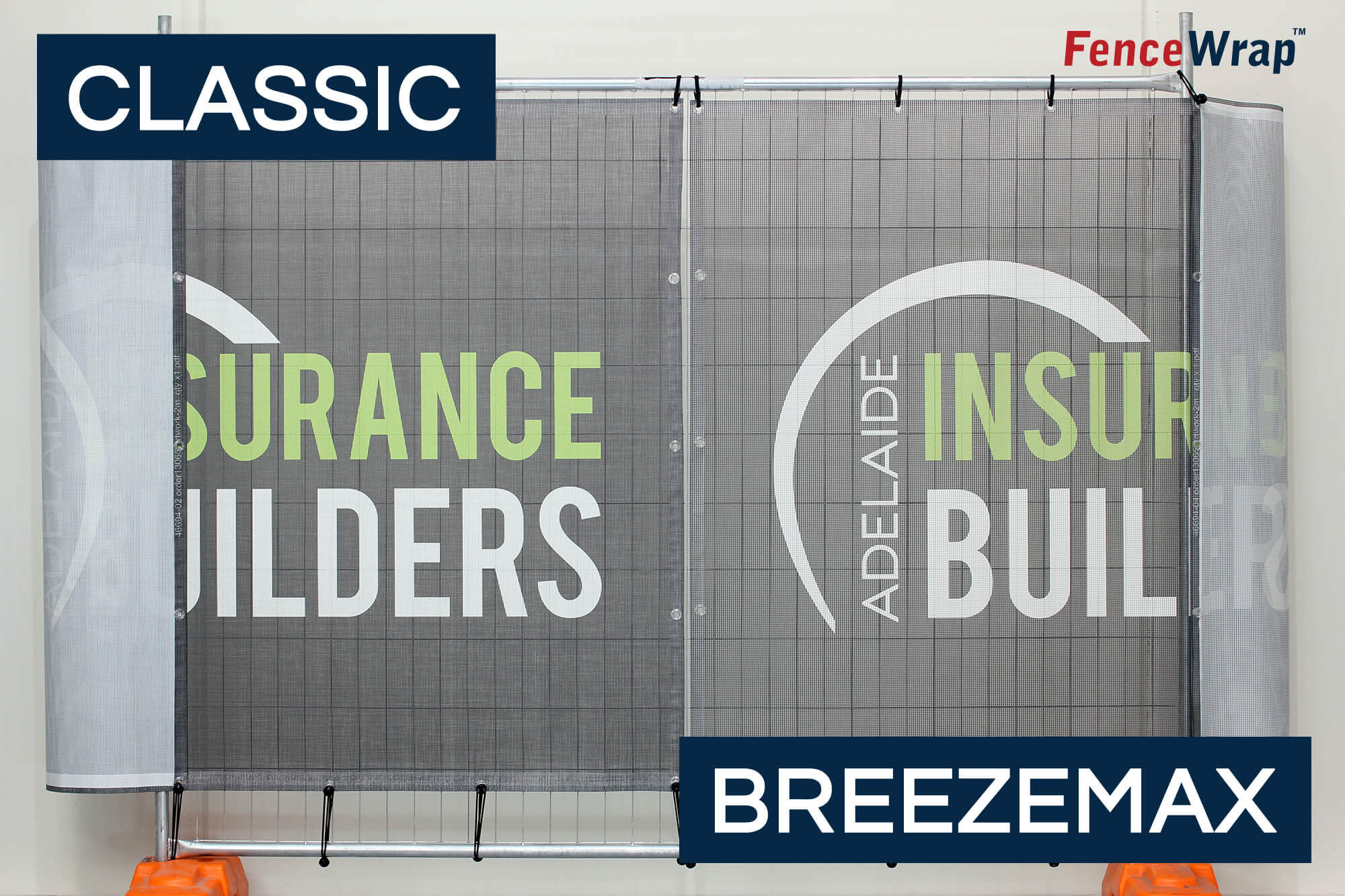
We just recently finished a job for Adelaide Insurance Builders and their order included a combination of both FenceWrap Classic and Breezemax panels, so we thought it would be a good opportunity to set them both up on a fence to compare the them, but also to move that panel around in different lighting conditions to show you a side by side comparison of how the lighting affects the appearance.
Scenario 1: Perfect Lighting
The first environment that we set up the panels in was our showroom here in Melbourne.
This is a rather artificial test because here the lighting is perfect. There are no shadows, lighting behind and in front of the mesh is the same, and really, this is what would consider a purely mesh based comparison (ie - we’re really just only comparing the holes in the mesh)
As expected, you can see that the Breezemax shows more of the background then the Classic banner mesh, and this is no surprise as that’s the key feature of the Breezemax - larger holes for windier environments.
In this scenario, even though the Breezemax has the larger holes, we still believe it does a great job of making the brand look good, and effectively communicating that to passersby.
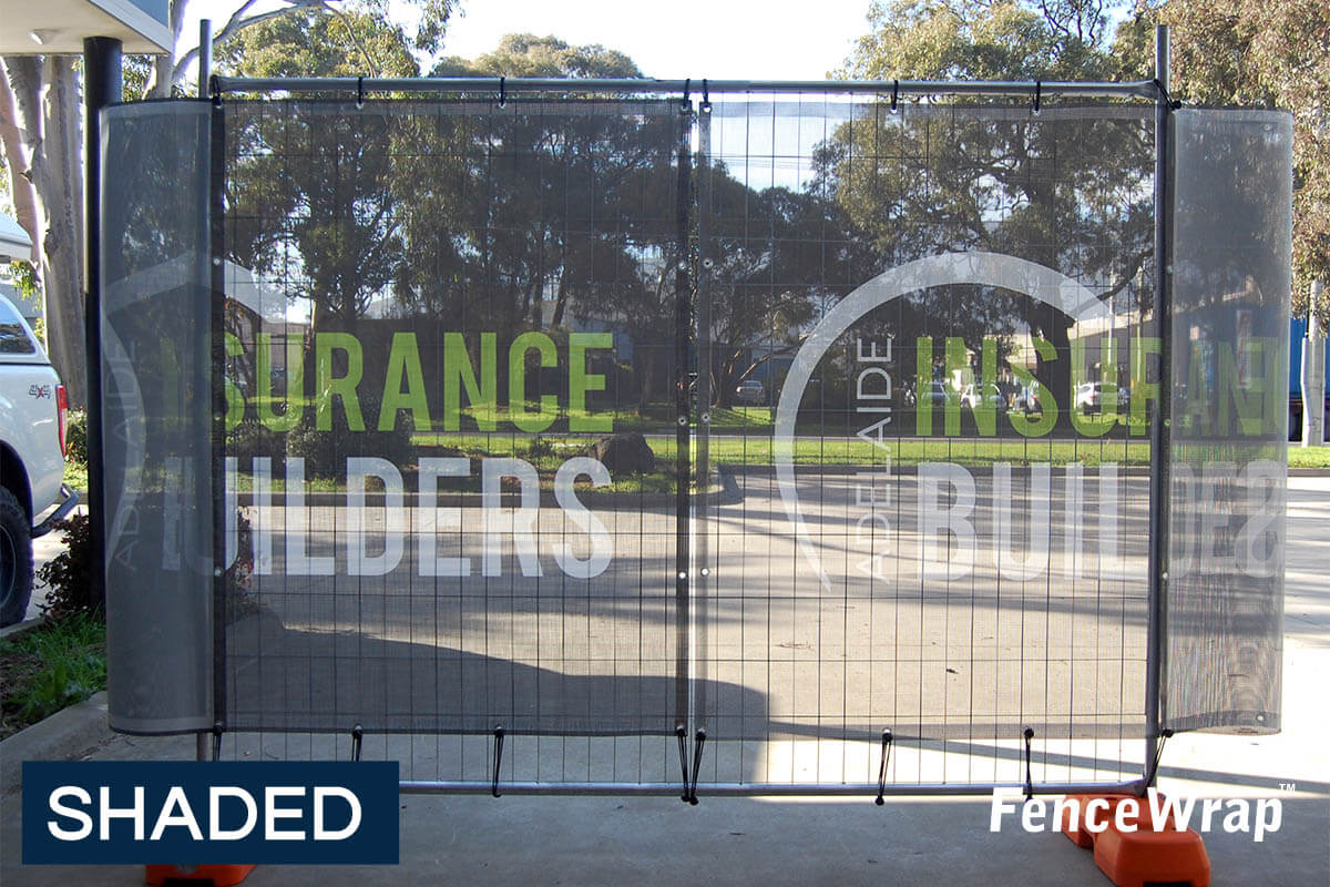
Scenario 2: In Shade
This is the scenario where the mesh will appear most transparent. This is because the mesh itself is in the shade, and the background is very bright.
Therefore the brightness from the background will “come through” the mesh, and make it appear most transparent.

Additionally, in this example, the AIB EzyPanel banners are printed black which gives the most transparent appearance.
This occurs as rather than the surface of the mesh reflecting back to your eye and little light there is, the black ink absorbs that light (that’s how black is actually made), further adding the transparent look.
In this scenario the difference between the apparent transparency of the meshes is most highlighted.
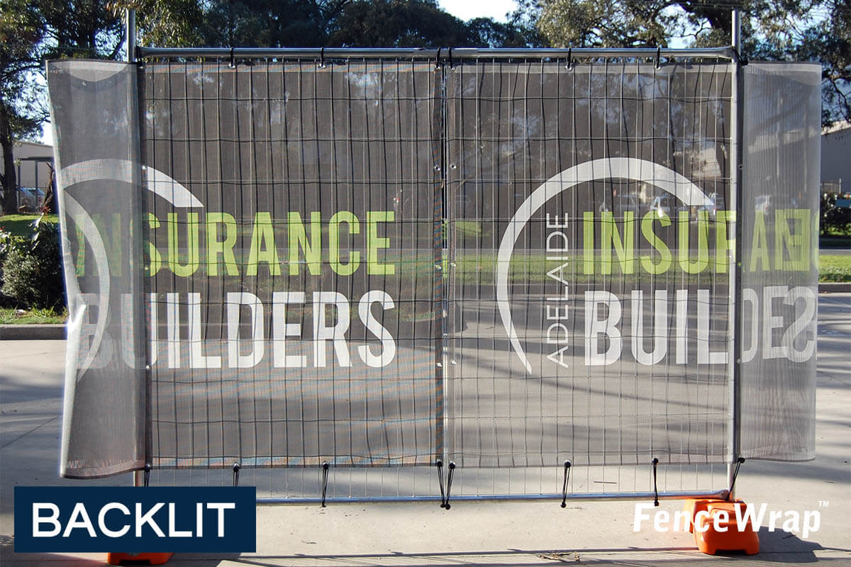
Scenario 3: Bright Light Behind
This example is the first example of light hitting the mesh, but from behind.
Because the mesh is not only transparent (because of the holes) but also translucent by nature, as soon as any lighting starts hitting it, it starts looking a lot less transparent.

Now the colours appear more vibrant, and overall the mesh looks a lot less transparent because the contrast between a bright background and the mesh, is not so evident.
And although there is a visible difference between the Classic and Breezemax, now that light is hitting it, the difference is much more subtle.
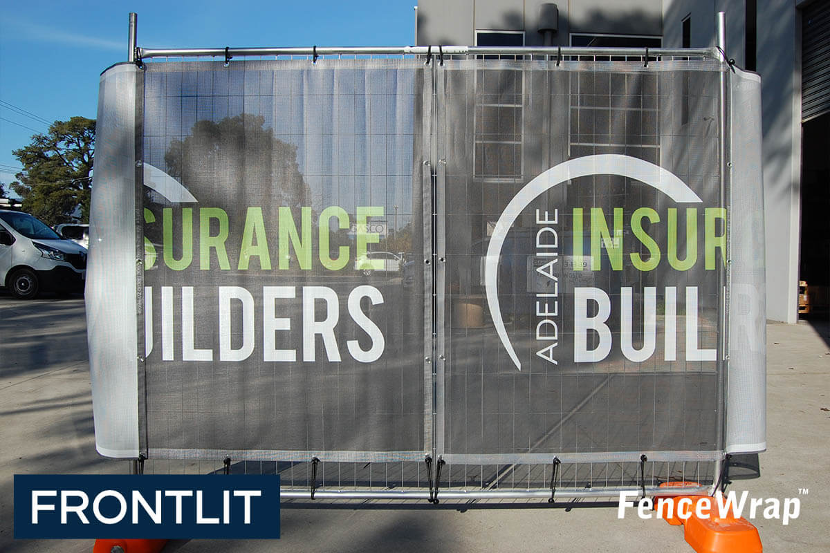
Scenario 4: Bright Lighting In Front
This scenario will have your mesh looking the best regardless of the grade of transparency you choose to buy.
This is because any light hitting your eyes is doing so by having been reflected by the mesh. This makes the colours look most vibrant, and gives them the highest level of contrast to any background visible through the mesh.

In this scenario you will notice very little difference between the different grades, even if you compare PrintMax to BreezeMax.
One point to consider here is that the darker the background is, the more transparent it will appear anyway, as less light is being reflected to your eyes.
Our Summary
Different lighting conditions affect the apparent transparency of FenceWrap.
Whether the FenceWrap is in shade, or light, will have a significant effect on how transparent it appears, and how much of an impact your mesh makes.
The most challenging scenario for the mesh is actually being shaded, with a bright background, as the background becomes extremely visible through the mesh.
In saying all that though, regardless of the grade you choose, your FenceWrap will look great and help you get your brand out there.
1300 55 82 47
AUSTRALIA WIDE DELIVERY


