We understand that not everyone has bought printed mesh before, and so we think it’s important to communicate with you certain information about buying mesh that will help you with your buying decision.
As with all things, there are little intricacies about the product that need to be considered when making a decision on what to buy.
The Product
Before you start and choose your mesh, you need to be sure that you’re picking the right grade for what you’re trying to achieve.
1. Pick the mesh grade that aligns with your priorities
Banner Mesh is our highest quality FenceWrap that's available - both in terms of print impact, but also longevity and finish.
We manufacture FenceWrap in three different grades of banner mesh, they are:
- PrintMax - Made for applications where the highest priority is the print impact and wind is not much of a concern. We recommend this for applications where you’re printing full colour photos, or the viewing distance is very short. It also provides the most privacy / screening of a site, so if you don’t want people to see through the FenceWrap very much, this is the option for you.
- BreezeMax - The opposite of PrintMax where air permeability is the highest priority, and the print impact is secondary. This is a great choice for unsupported temporary fences as it will reduce the wind load on the fence. It must be noted though, that because the holes are the largest in BreezeMax, there is less surface to hold the ink - making it more transparent and the print will appear more “washed out”.
- FenceWrap Classic - With moderate air permeability, and a good print impact, this is a good balance between the two if you can’t decide between PrintMax and BreezeMax.
All of our banner meshes are printed on the same printer, meaning the quality of the print will be of equal quality on all the meshes, just that when you choose a more open weave mesh like BreezeMax you have less actual material to hold the ink, so that's why we say it has less of a print "impact".
2. Step down your mesh height depending on your fence height
Typically temporary fences and fences in general are standard sizes like 1800mm, 2000mm and 2100mm.
We always recommend that the mesh height chosen is shorter than the fence it’s going on.
For example, on a 2000mm/2100mm fence, we recommend using 1800mm FenceWrap, and on a 1800mm fence we recommend using 1600mm tall FenceWrap.
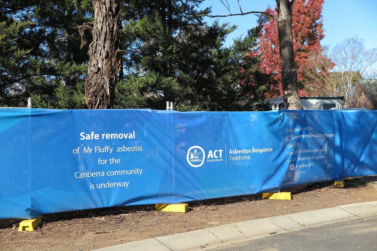
The reasons for this are:
- The FenceWrap itself will be perfectly square, whereas the fence will have to follow the ground it’s on. It’s unlikely that the ground is perfectly level, so you can end up with creases in the installation as it follows the fence. Using mesh with a smaller height will help in avoiding creases and allow a smoother installation.
- Using a smaller height FenceWrap on the fence will allow it to better “stretch” onto the fence, giving a neater appearance to the finished installation.
So for the best aesthetically pleasing result, it is definitely worth considering your installation before choosing your mesh height.
3. Don’t forget, this is mesh, not a solid surface
Here is an example of the same print on all the PVC we print, from left to right - 100% Vinyl, PrintMax, Classic, BreezeMax.
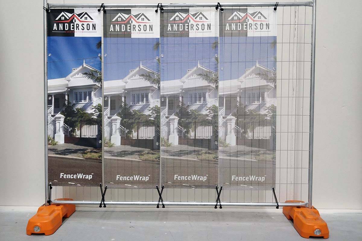
These are all printed on the same printer, same inks, same everything. It’s just the substrate that is changing.
You can see the drastic difference between all the different grades and that any print on mesh will appear more washed out than what you’re used to seeing on a solid surface.
This is because once you start to put holes in the mesh, the light from behind starts coming through and “washing out” the print. Hence, if print impact is your top priority, get PrintMax and reinforce your fence.
4. How light hits the mesh affects the final appearance
Lighting conditions also affect the appearance of the mesh as does the product choice and artwork choice.
The mesh can be sunned from the front, or the back, or not at all.
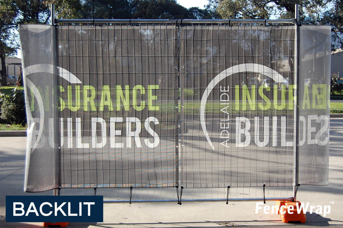
Generally, if it’s being lit from behind, the “washing out” effect will be increased, and the mesh will appear more transparent.
This is particularly true if you’re using a BreezeMax, and printing it black. We recommend for backlit applications to use PrintMax and a white background colour.
We’ve written a full article on this topic.
The Artwork
What you print on the mesh makes as much of a difference as does what mesh you choose to buy. Both the product choice and the print design need to be taken into consideration.
5. The darker the background, the more transparent the mesh will appear
Even though the mesh itself doesn’t change based on what’s printed on it, the colours used can have an impact on the visual appearance once complete.
Mesh that is printed black (or darker colours in general) will appear more transparent than mesh that is left white (or lighter colours).
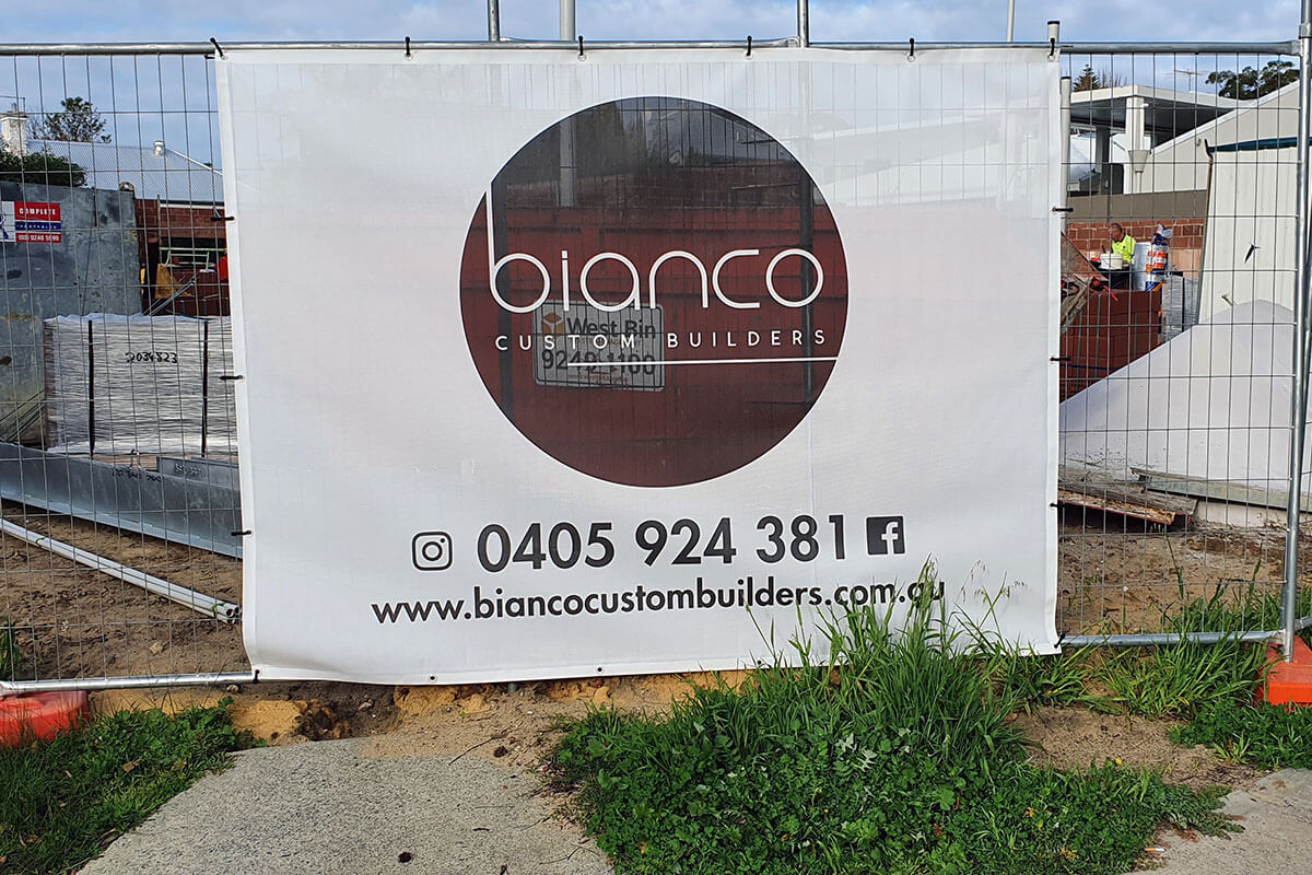
This is because when light hits the surface of the mesh, a black/dark colour absorbs the light and reflects very little back to your eyes. This means that anything that’s behind it that’s more reflective (i.e. lighter colours) will be more easily visible through the mesh.
This is opposite for white / light colour meshes as it reflects more light back at your eyes and therefore appears less transparent because it’s brighter than what’s behind.
If you are using your mesh as a privacy screen, go with a white background.
6. Contrast is king
What you print on the mesh is also affected by the colours that are used on the different elements of the artwork design.
Because the material is a mesh, you are already losing some print impact compared to a print on paper or 100% vinyl or anything solid. If you are using a dark colour in your logo or your text, we recommend avoiding a dark background colour.
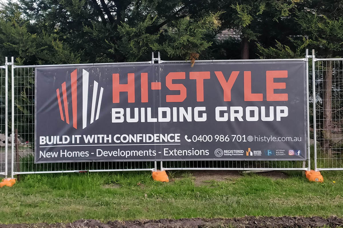
For a truly eye-catching design, maximise the colour contrasts. Use light colours for text / logos on a dark background, and dark coloured content on a light background.
While dark backgrounds typically make whatever is sitting behind the mesh more visible, it also helps draw more attention to brightly coloured text and logos.
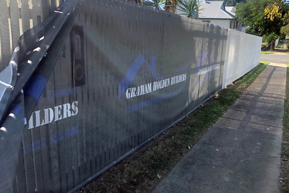
You can see in the above photo that the white text looks fantastic, and is easy to read, but the dark blue colour in the logo is very hard to distinguish from the black background.
The same goes for printing light colours on a white background. We recommend keeping all greys on a white background above CMYK 0/0/0/25 to ensure that they’re actually visible once printed.
7. CMYK, Pantone, what does it all mean
When it comes to printing, colours are defined by CMYK values.
Basically, a CMYK value tells a printer how much ink to shoot at the surface. A CMYK colour of 50 / 10 / 20 / 0 means it will shoot 50 drops of Cyan, 10 drops of Magenta, 20 drops of Yellow and 0 drops of Black.
Think of it like a recipe when cooking. However, the tricky thing with CMYK values is that they won’t appear the same on all printers as they all manage colours and are calibrated differently; just like when 5 people cook the same recipe, all those dishes will taste a bit different.
Most logos will have CMYK values defined, but sometimes a brand will have both CMYK values defined (for when printers don’t have any Pantone calibration) and Pantone codes too. Here Harbour Trust has both a CMYK value and Pantone colour defined in their style guide. We printed a sample of both, and the feedback we received was that the Pantone was more true to their brand.
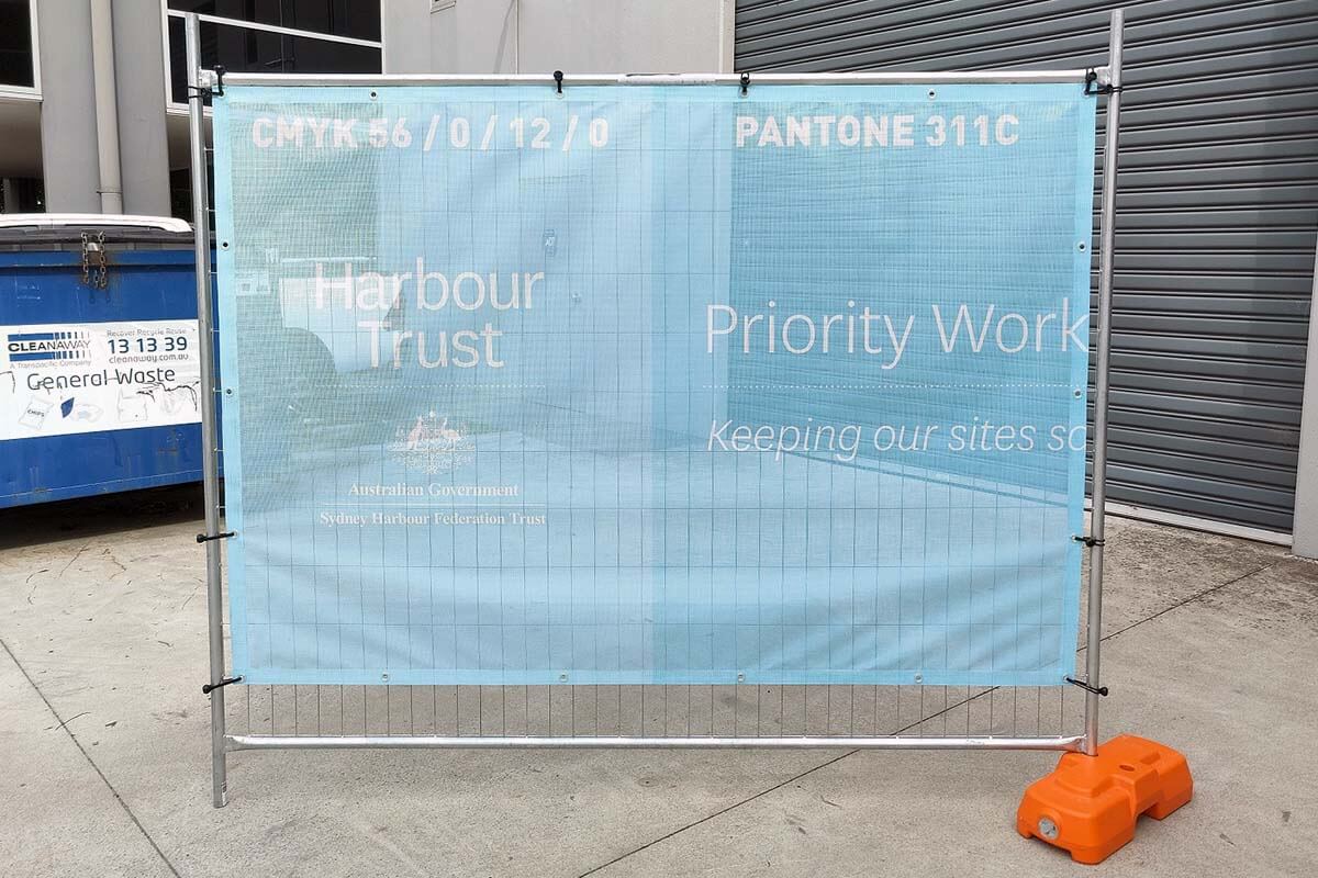
Pantone colours on the other hand is an internationally accepted colour matching system. Everyone in the world has the same pantone book. When we use a Pantone colour in the artwork instead of a simple CMYK value, the printer will pick that up and adjust what it shoots to the surface of the mesh based on our most recent Pantone calibration test.
Take note though, using a Pantone will not mean the colour will be “perfect” (which is subjective anyway), it just means it will be the closest possible match that we can achieve. You still need to consider that you’re printing on a perforated material,, which will give the colours a more “washed out” effect.
8. Black will not be jet black - but it will be black
Black is a very popular choice as a background colour, but it can be a bit contentious at times. A black background will not print jet black, and there are a few reasons for this explained below.
We use a “UV Printer” and “UV inks”
Our printer is a type called a "UV Printer", which we use specifically because UV inks have the best outdoor durability, don't fade quickly, etc.
In general, UV inks produce a matte finish compared to other types of printers like Solvent and Latex printers which give a deeper, gloss-like finish. The downside to Solvent and Latex is that they don't have the same outdoor durability and fade resistance, making it less ideal for mesh.
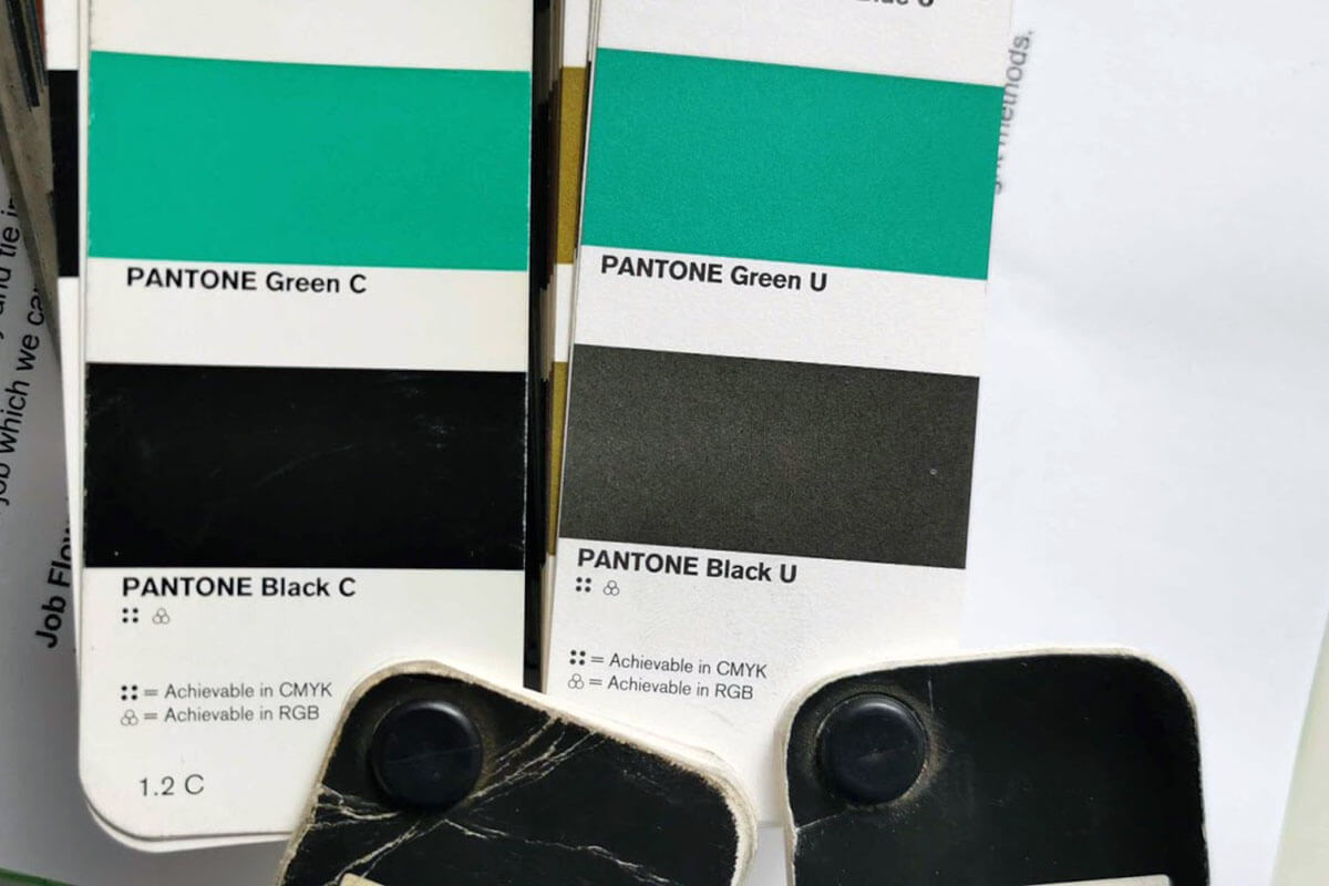
It’s very similar to when a car is painted in gloss black, and matte black; they're both a true black, they just look different because of the finish.
We always use rich black over true black
So instead of using just 100% (CMYK = 0/0/0/100) black in our print, we always adjust to using a rich black in our artwork that adds 40% cyan, magenta, and yellow into the colour.
This helps significantly compared to if it was just 100% black, but unfortunately you still cannot avoid the “washed out” look when printing on mesh.
Being mesh doesn't help
We use the same printer and same settings to print all the different materials we print on. You can see in the below photo the exact same print on the 100% PVC through to the BreezeMax.

It looks quite good on 100% PVC, but as soon as you step through to a mesh, some of that light comes through and washes the print out. Of course, if this is coupled with the fact it's UV ink and matte in finish, it adds up to appear less black than jet black.
Setting it up outside will improve the appearance
Once the mesh is installed outdoors, the mesh’s appearance will immediately improve and draw attention from the natural lighting and shadows in the surrounding environment.
It is important to be aware of where you are setting up your mesh, so you can really maximise the impact of your design. If there will be a lot of light behind the mesh, the backlit effect will greatly affect the appearance of black and darker colours.
Do you have a particular design in mind, but not sure how it will turn out? Our team here at FenceWrap are happy to offer our expert advice, as well as arrange multiple artwork revisions and print samples.
1300 55 82 47
AUSTRALIA WIDE DELIVERY

